Friday 22 April 2016
Monday 28 March 2016


Friday 25 March 2016
'A Lost Soul' Future Aspirations
Now that my media product has now been completed, my aspiration for "A Lost Soul" is to enter the product into short film festivals such as BFI, Cannes and Sundance. From these film festivals, my product will be able to reach a much broader audience which could benefit from the word of mouth. Another potential benefit would be to gain recognition from studio executives and producer in order to then gain funding to produce a feature film based on the short film "A Lost Soul"; examples of previous cases are with Wes Anderson's "Bottle Rocket" and Damien Chazelle's "Whiplash" all films that were based of the film-maker's short films created to pitch their feature film.


As for other future aspirations I have for my project, as the director if I am granted the opportunity to revisit the material within a feature film; I would like to expand on the world within the story by increasing the visual scope of the film through the IMAX experience. If the studio granted my project an IMAX release, I would then be able to edit the sequences and the sound mix accordingly ensuring that my film will certainly be able to offer the audience the best possible way to be fully immersed within my story through the large format and extensive sound system that IMAX theatres can provide.
Overall these are predominantly the main aspirations I have regarding my project and it's potential success in the future as well as the different aspirations I have as a film-maker.
Overall these are predominantly the main aspirations I have regarding my project and it's potential success in the future as well as the different aspirations I have as a film-maker.
Thursday 24 March 2016
'A Lost Soul' (Age Rating)
During the planning, I researched the BBFC and their age rating classification. Within my research I looked through the different age ratings and evaluated the various reasons as to why the BBFC would classify particular age rating.
In regards to classifying the age rating for my media product "A Lost Soul" it has been given a "15" as my product consists of the following:
- strong violence
- frequent strong language (e.g. 'f***').
- portrayals of sexual activity
- strong verbal references to sex
- sexual nudity
- brief scenes of sexual violence or verbal references to sexual violence
- discriminatory language or behaviour
- drug taking
My product meets four of these points; strong violence/blood, strong language, discriminatory language/behaviour and drug use. This is ultimately why my film has been granted a 15 certificate by the BBFC. This will strengthen the product as our target audience is young adults and older. Ultimately I am happy with this certificate as it still allows me to present may original vision without manipulating the product to fit a lower rating as this still allows me to cater my target audience, the mature demographic.
Tuesday 22 March 2016
'A Lost Soul' Final Poster

This is the final version of my poster, where I have addressed all of the feedback made from previous drafts; last main adjustment made was to the fonts besides the title as they needed to be separate from the title in order to help focus their attention to the red font on the main title but also in some areas particularly with the release date on the bottom is to help with visibility.
Overall I am extremely satisfied with the poster as it does a perfect job at encapsulating the tone and style of my media product whilst teasing what audiences can expect to see.
Monday 21 March 2016

Final Colour Grading & Sound Mixing (Editing Session #5)
Within my 5th editing session, my main task was to finalise the colour grade and sound mix of my media product. The overall colour grade and sound mix if good, however there are some sequences that need to be edited further.
In regards to the colour grade, there was a small aspect that needed to worked on and that was the sandwich shots; in previous drafts the colour of the shot and the sandwich has differed from the rest on the sequence and the shots to follow. In my previous drafts, the sandwich had appeared green which was off as the sandwich was made from brown bread; this was a result of the shot consisting on a blue tint and affecting the sandwich's colour overall.
How I approached the colour grade is by revisiting the old treatments of the shot to help me understand what I had previously done with the shot in order to aid my decisions when making changes to the new edits.

As for the sound mixing, there where moments within the media product that had no ambient sounds which made the sound feel empty. In order to fix this, I added background noises from the machines within within the basement in order to make the sound feel organic but also make sense to the mise en scene.
In regards to the colour grade, there was a small aspect that needed to worked on and that was the sandwich shots; in previous drafts the colour of the shot and the sandwich has differed from the rest on the sequence and the shots to follow. In my previous drafts, the sandwich had appeared green which was off as the sandwich was made from brown bread; this was a result of the shot consisting on a blue tint and affecting the sandwich's colour overall.
 |
| Colour grade from "Rough Cut #4" |

For this colour grade, I edited the shots individually and edited them from scratch. I used RGB curves to adjust the various colours within my shot, reducing the amount of green and blue in order to return the brown colour into the sandwich.
 |
| Final Version |
But after all of these adjustments have been made, my product is finally complete as I have made all of the adjustments and changes to believe the product I believe is of high quality and I am satisfied with my final cut as it presents my original vision; now it is ready to been seen.
Sunday 20 March 2016
'A Lost Soul' Poster (4th Draft) and Feedback

This is near to thew final version of my poster, this addressed many comments made on the previous draft. Within this draft, the changes that I have added to the poster is the release date, actor credits and the release date. These improvements have made the poster more conventional, however there are some minor adjustments that need to be made in order for the poster to be complete. In regards to the text, I need to change the colours on the release date and the actor credits in order to help the title stand out but as well as to help visibility of the text.
Friday 18 March 2016
'A Lost Soul' Poster 3rd draft (Responses)
After creating the third draft of my poster, I gave it to my two media teachers in order to gain some feedback regarding my work in order to learn what works and what doesn't. Overall they like the layout of the poster, they find it effective and presents my product very well. However there are particular conventions that are absent on my poster such as: actor credits, release date and age rating; this point will be brought in the next version of my poster. The most unsatisfying comment was the fact that they didn't like the disintegration element within my poster as they didn't understand the visual message as they assumed it was dirty or tree leaves coming off from the subject's face. I was disappointed to hear that as I was eager to incorporate this idea within my poster but there perception of it was understandable as I received a similar reaction from friends and family which meant that clearly something was not clear on my part as the graphic designer.
Overall there feedback was extremely beneficial and will most certainly be addressed within the next draft of my poster.
Overall there feedback was extremely beneficial and will most certainly be addressed within the next draft of my poster.
Wednesday 16 March 2016
'A Lost Soul' Poster (3rd Draft)

This draft was an experiment I made to see how my original vision for my poster would look, now I intend on gaining feedback from my media teachers on whether or not they find it effective or not; based on their feedback, I will determine whether I should continue to improve on this design or to just abandon the idea complete. Regardless of the outcome, I created this design to ultimately present my original vision for the poster of my short film.
Monday 14 March 2016
'A Lost Soul' Poster 3rd Draft (Editing)
For my 3rd draft I wanted to create a new poster that resembled my original design for the poster. My overall inspiration towards the design was the poster for "Sicario". How I intend on being influenced by this poster is by using the concept of fading various images from my media product into the main image of my lead character's head.
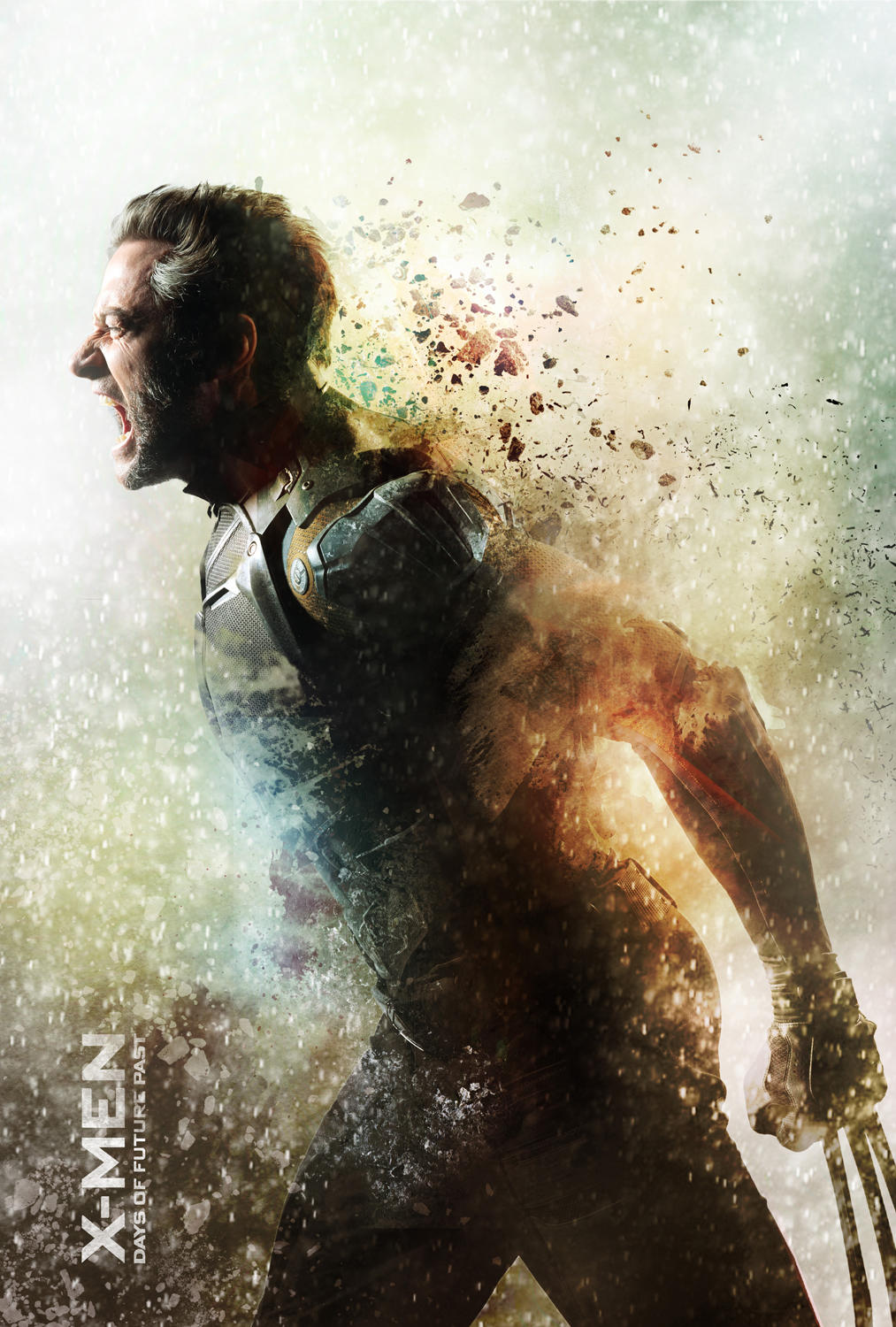
Another idea I intend on including within my poster is the element of disintegration, my inspiration for this idea was seen in form of promotional artwork for "X-men: Days of Future Past". The reason as to why this idea appeals greatly towards my product is because the idea of disintegration particularly regarding the "X-men" image it this idea of losing yourself and not being whole. For the character 'Wolverine' within the image, he appears to be struggling with the pain of loosing who he is, slowing falling apart one layer after another. This really intrigued me as this would be a very interesting concept to apply to my poster, adding the disintegration effect on the lead character 'Max' adding this visual metaphor of him loosing his soul and the impact that will have on the vessel contain his soul; without the soul the human body cannot survive and will begin the decay. This will add great depth towards the poster as it can hint a lot to the promotion of the media product as it can hint a lot to the audience as to what they can expect to see from this story.
 |
| Inspiration |
 |
| Disintegration Inspiration |
In order to achieve this effect, I did some research towards on how I could achieve my vision. I came across this tutorial that helped explain I could present my idea of disintegration on my poster; this video provided me with a set by set guide to how I could do it.
Saturday 12 March 2016
Overview of responses from 2nd Screening
After reviewing all of the feedback from the 2nd screening of my film, I am pleased with the initial reaction to this cut of my media product as the test audience was positives; rating the film overall between 7-10/10.
I did receive comments on minor aspects of the film, however these comments were addressing parts of the film that I as the film-maker intended. An example of these comments was addressing the grainy look of the cinematography; this was an idea I intended to add to the visual style of my media product in order to emulate and 35mm film look towards my product. However this comment was constructive as it made me rethink the effect and glare at the entire edit in order to ensure that the effect doesn't seem to distort the audience's attention and focus to the story; this was in fact only 1 comment out of the 8 received.
Overall the reaction to my media product is significantly better in the second screening in comparison to the first, I will now continue to finalise the edit of my media product.
Wednesday 9 March 2016
Feedback from 2nd Screening
Today I had another screening of my short film, during this screening I handed out response sheets to my test audience in order to gain some feedback; I designed the questions to be answered through numerical rating. This decision was to make the audiences more comparative in their response as they know there is a lack of writing involved but in also can provide me data that can be quantified.


Wednesday 24 February 2016
Scheduled 2nd Test Screening
UPDATE!
I have scheduled for a 2nd test screening for the 9th March, my plans for this screening is to preview my latest cut of my short film in order to see if my new alterations made to the film has improved it's overall quality; but as well as gathering more constructive criticism on my project.
Sunday 21 February 2016
Tuesday 16 February 2016
4th Editing Session
Within this session of post production work, the main objective within this draft of my media product is to approach this edit with the feedback from the test screening in mind.
The major changes made to the edit is trimming a few shots, in particular the slow motion shot as this was identified as a shot that diminished the overall production value of the entire sequence. In order to fix this, I replaced the shot with a take that simply had the radio fall in one drop instead of bouncing and prolonging the shot; resulting in a quick but effective shot.
One other trim made to the film is within the eye line match within the opening of the short film, cutting out the shots of the eyes reacting to the blood on the actor's hands. This decision was made particularly due to pacing as this small sequence over welcomed its stay according to feedback from the screening and from my teachers. By only using the one shot of the blood covered hands, the same message is delivered regarding the shock the character is feeling just simply without the intensity seen with the eye line match.
In regards to the sound mix, the significant change made was towards the ear ringing sequence during the office scene. During the test screening, many complained it was far to painful to hear and therefore disconnected them the story. I then took this as a priority to reduce the level of the effect as well as reducing the duration of the sound effect.
last addition made to the product is the inclusion of a production logo as well as credits. Overall the product is assembling very nicely and will be continuing to perfect the edit.
Thursday 11 February 2016
Evaluation Questions
As I come closer to finalising my main task, the evaluation questions grow more relevant after every edit or decision made to the project. In order for my project to succeed; I must ensure that I am more than capable of answering the evaluation questions whilst referring to my media product.
- In what ways does your media product use, develop or challenge forms and conventions of real media products?
- The ways my media product uses conventions is to mainly ensure that the audiences are familiar with the genre of 'Thriller' as well as their expectations; by using the forms and conventions associated with the genre, I can gain their attention and resulting them in engaging with the story. How my media product challenges these conventions is by altering the idea behind the antagonist/protagonist within the story, changing the way we as an audience perceive characters based on generic codes and conventions as we tend to be introduced to the protagonist from the opening shot. I've also challenged the conventions of casting within my film by casting an asian actor as the lead of the story, something within the industry lacks as we tend to see a predominantly white cast of leading characters within film; a fixed form I intend on breaking.
- How effective is the combination of your main and ancillary texts?
- The combination of both tasks allow me to share the content between them; which lead to the creation of both tasks.
- What have you learned from your audience feedback?
- From my audience feedback I learn a lot in regards to what they are paying attention as they watch my media product. Picking out what they liked in relation to the story and performances; as for the negative comments, it was primarily due to not understanding certain narrative aspects. The negative criticism was brought to my attention, however there was no significant changes I could make as their questions where already answered within the product; they just were not paying close attention.
- How did you use new media technologies in the construction and research, planning and evaluation stages?
- The various task I had required me to use new media technologies such as adobe premiere and photoshop in order to create the different ancillary tasks. The internet is a huge tool used, web 2.0 is a notion that I gathered a lot of data from that fuelled my knowledge and creativity regarding my planning and evaluation.
Saturday 6 February 2016
Film Review (Draft 2)

This is the second draft of my film review, within this edit I have written the review of my film as well as including a quote besides the main image. However comparing the layout of this draft with my research of magazine reviews; the review itself would be broken down and presented in columns. This will require me to re-edit the way the review has been presented in addition to adding additional content within the review in order to make up the space with smaller font.
Sunday 31 January 2016
Film Review (Draft #1)

This is the 1st draft of my film review, it is merely just the layout as the film review itself is still in the works. However based from this draft I already gathered some constructive criticism, overall the design works well and the way images from the media product have been incorporated in the review. The main comment made is regarding the selection of font for the text within the plot, it appears difficult to read and therefore must be altered.
I will be adding the film review soon after I have made changes to the rest of the layout.
Tuesday 26 January 2016
Feedback (Analysed)
The feedback I had received from my screening was extremely constructive, identifying was works and what doesn't. Not only did I learn that my media product is succeeding it it's ability to engage the viewers with the story and characters but that audiences are enjoying the product. These praises have been heavily geared towards the dark and grounded style behind the narrative but also the love towards the office sequence; the positive feedback also justifies my influences towards my decision to cancel the director's cut of my product. However there are some aspects that need adjustments such as the sound and particular shots such as the slo-mo shots; this will inform my decisions within the next few edits of my product.
Thursday 21 January 2016
Test Screening, Focus group & feedback!
I recently had a test screening where the third rough cut of my project was presented to a focus group, feedback was gathered from the screening and which I gained a positive review with some constructive criticism that will influence the next cut of the project.


Tuesday 12 January 2016
Director's cut CANCELLED!
After looking through my 3rd rough cut, I have decided to cancel my plans to create a director's cut. This decision was based due to discussions and feedback given from the previous rough cuts, as my intentions with the director's cut was to include the office sequence in a seperate edit of the product entirely. However based from the overwhelming reaction to that particular sequence in the product has made me decide to have include it inthe final cut whilst trimming shots down in order to keep the media product at an effective pace.
Over the next few draft I plan to finalise the edit in terms of trimming the timeline and adjusting the sound mix in addition to the colour grading.
Over the next few draft I plan to finalise the edit in terms of trimming the timeline and adjusting the sound mix in addition to the colour grading.
Friday 8 January 2016
Tuesday 5 January 2016
Poster Draft #2 (Comments from teachers)
The initial thoughts on the 2nd draft of my poster is that it's layout is effective, particularly due to the improvements made to the previous draft. These improvements made to the edit of the outlines with the main subject; another improvement made was on the font sizes. However in regards to this draft, I still need to make adjustments to the different fonts and single them down to at maximum of two.
Monday 4 January 2016

Subscribe to:
Posts (Atom)